
Color has the ultimate power to evoke genuine emotions, convey messages, and create unforgettable experiences. In the world of web design, understanding the fundamentals of color theory is a must if you want to create visually appealing and user-friendly websites.
From choosing the right hues to mastering color harmony and contrast, this blog post will dive deep into the principles behind effective web design coloring. Let’s unlock the secrets of color theory together.
Hue
When we talk about hue in the context of color theory, we’re referring to the purest form of a color. It’s what distinguishes one color from another on the color wheel – think red, blue, yellow. Understanding hue is like understanding the building blocks of color. In web design, selecting the right hues can make or break a website’s overall aesthetic appeal. Whether you opt for a monochromatic palette or experiment with complementary colors, paying attention to hue is crucial for creating a visually harmonious design that resonates with your audience.
Saturation
Saturation, on the other hand, refers to the intensity or vividness of a color, ranging from muted tones to vibrant hues. By adjusting the saturation levels of colors used in your web design, you can create different moods and evoke specific emotions within your audience. A high level of saturation tends to grab attention and create a sense of energy and excitement, while desaturated colors can convey sophistication and elegance.
Value
By strategically using different values within your color palette, you can guide the viewer’s eye toward important elements on your website. Darker values tend to recede into the background, while lighter values pop out and draw attention. Experimenting with various value combinations can help you achieve balance and hierarchy in your design. Whether you opt for high-value monochromatic schemes or contrasting light and dark colors, understanding how value impacts perception is key.
Color Harmony
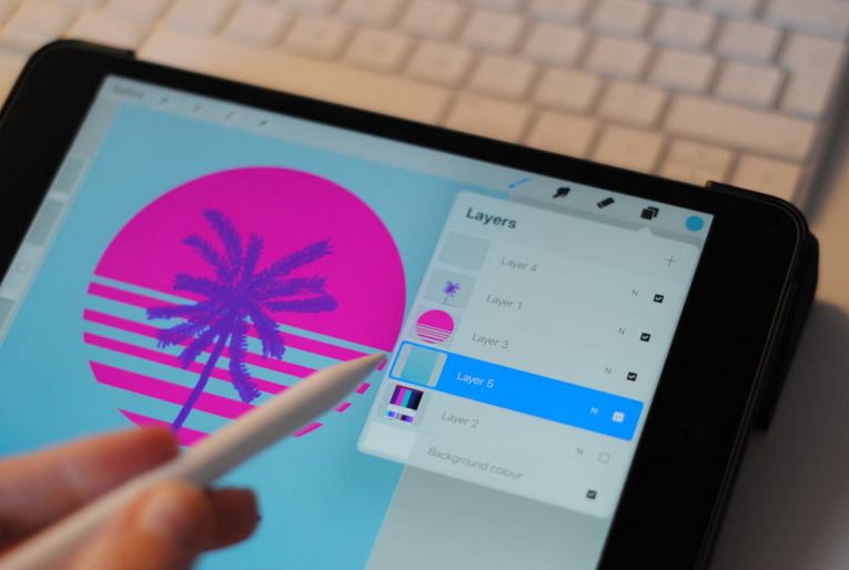
Now, let’s talk about color harmony. Basically, it’s like a symphony of colors working together in perfect unison to create visual appeal and balance on a website. These free Procreate coloring pages are perfect for exercise. Choosing a dominant color and then using harmonious shades to support it can create cohesion throughout the design. This helps guide users through the website seamlessly without causing distractions or confusion. Note that color harmony isn’t just about aesthetics; it can make a difference in conveying brand identity and communicating with your audience effectively.
Color Contrast
Last but not least, color contrast is also a powerful tool in any web design that can create visual interest and enhance user experience. By strategically using contrasting colors, designers can make elements stand out and improve readability. Contrast is often a mix of variations in hue, saturation, or value. Pairing complementary soft colors such as blue and orange or using light text on a dark background are common ways to create contrast. This technique helps draw attention to important content and guide users through the website.
Bottom Line
By grasping concepts like hue, saturation, value, color harmony, and contrast, you can elevate your design skills to the next level. Experimenting with different color combinations and understanding how they impact user experience will help you create websites that not only look great but also resonate with your audience on a deeper level. So go ahead, play around with colors, embrace creativity, and let the principles of color theory guide you toward designing stunning websites that leave a lasting impression.
Comments are closed, but trackbacks and pingbacks are open.